A first look at Petal
A different
feeling of
time.
Colour worth a second look.
Details worth slowing down for.
We’re exploring a softer side of watch design, with expressive dials and compact, everyday proportions.
Discover the concept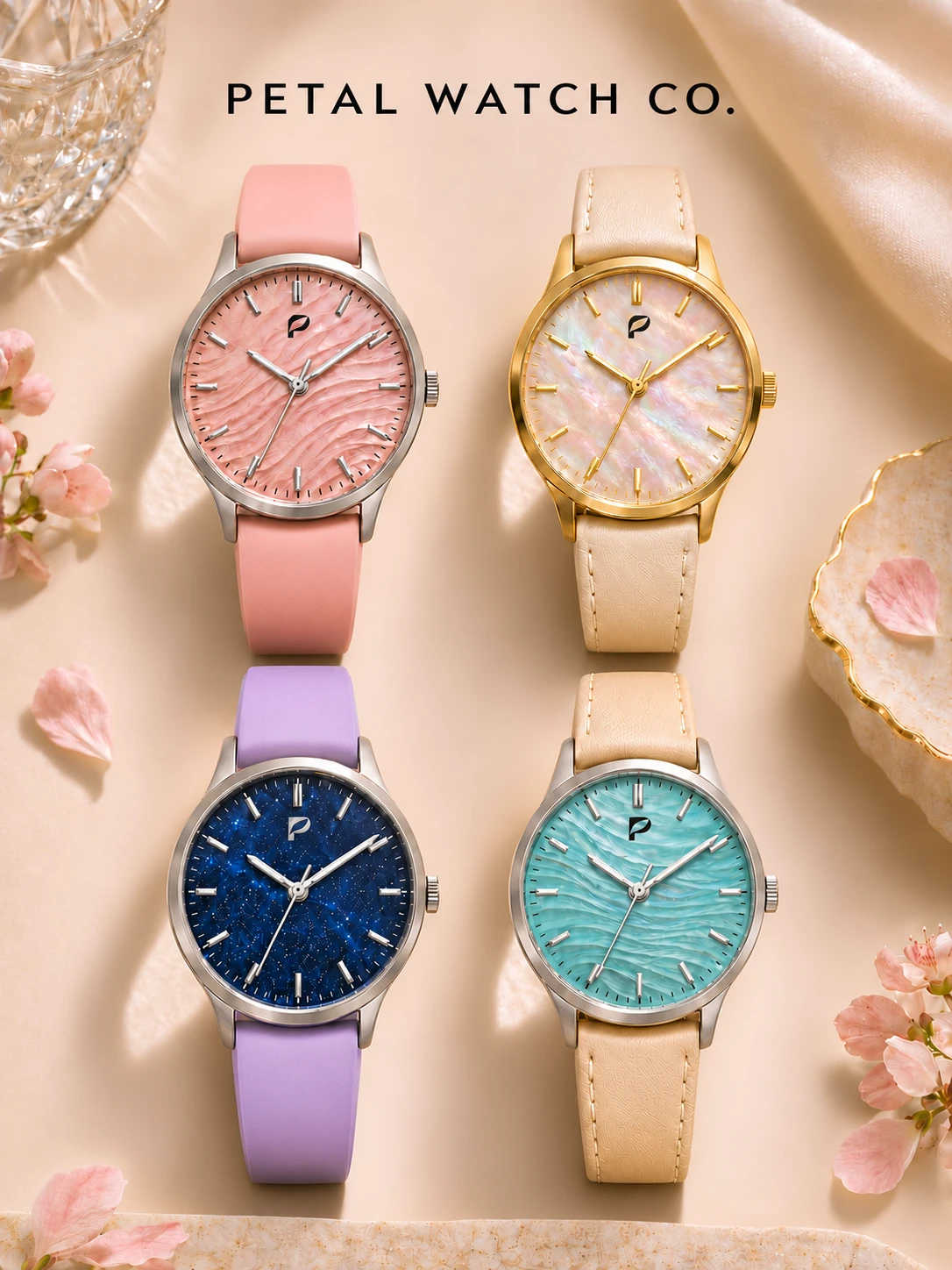
Made for your kind of day
A little more life.
Find a direction that feels like you.
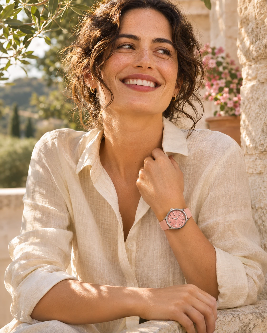

AI-generated lifestyle concepts, not actual product photography. Final watches may differ.
01 / The palette
Pick a feeling.
From a quiet blush to the depth of midnight. Four colour studies, each with a character of its own.
Soft colour. Strong character.
Blush
A wash of warm pink meets a rippled dial. Gentle at first glance, full of detail up close.
- Dial direction
- Rippled texture
- Colour pairing
- Pink / silver tone
- Signature
- The Petal symbol
A look at the design direction, not a finished product. Colours, materials and details may evolve.
02 / Another expression
A little more
edge.
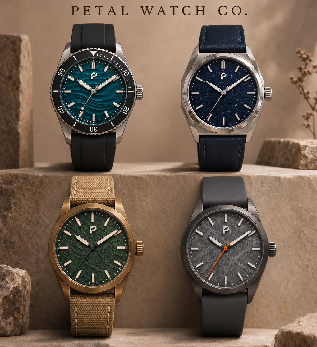
Deeper colour. Sharper lines.
The same attention to detail.
There’s more than one way to wear Petal. These bolder studies explore dark straps, stronger silhouettes and rich textures, from ocean teal to forest green and charcoal.
Early design explorations. No final specifications or availability are implied.
03 / Our perspective
Less about labels.
More about you.
A watch can be considered without being serious. Beautiful without being precious. Personal without fitting a category.
That’s the idea behind Petal: thoughtful proportions, a playful palette, and a small everyday object with a little more feeling.
Colour, with depth.
Textured dials and unexpected pairings.
Proportion, with purpose.
A compact, light-wearing design direction.
A signature, kept simple.
Just the Petal symbol on the dial.

Something new is taking shape
Good things take
a little time.
Petal Watch Co. is in the making.
More to come.